Website Loader Design
Bombardier Project
OVERVIEW
ROLE
I helped redevelop the MyBombardier Platform as an intern at Bombardier with the goal of improving the user experience for aircraft owners.
This project showcased the commitment to an adaptable, user-friendly digital environment by upgrading website loaders to increase accessibility and efficiency.
This project showcased the commitment to an adaptable, user-friendly digital environment by upgrading website loaders to increase accessibility and efficiency.
UX/UI Designer
User Research, Interaction, Visual design, Prototyping
User Research, Interaction, Visual design, Prototyping
The process
The redesign of the loaders for the MyBombardier Platform was a collaborative process that relied heavily on iterative design and a user-centric methodology. My main tool for working in the UX/UI team was Figma, which made it easier to create and edit the designs. The journey occured in multiple key steps:
- In the first stage, I thoroughly examined the requirements of our users, who are the operators of jets that use the MyBombardier Platform. It required knowing the kind of loaders the webpage required as well as how to make it appear while keeping in mind the color scheme and graphics the webpage utilized.
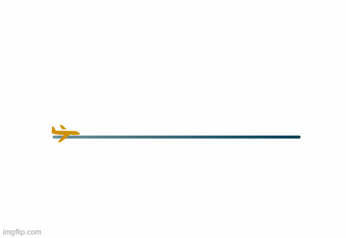
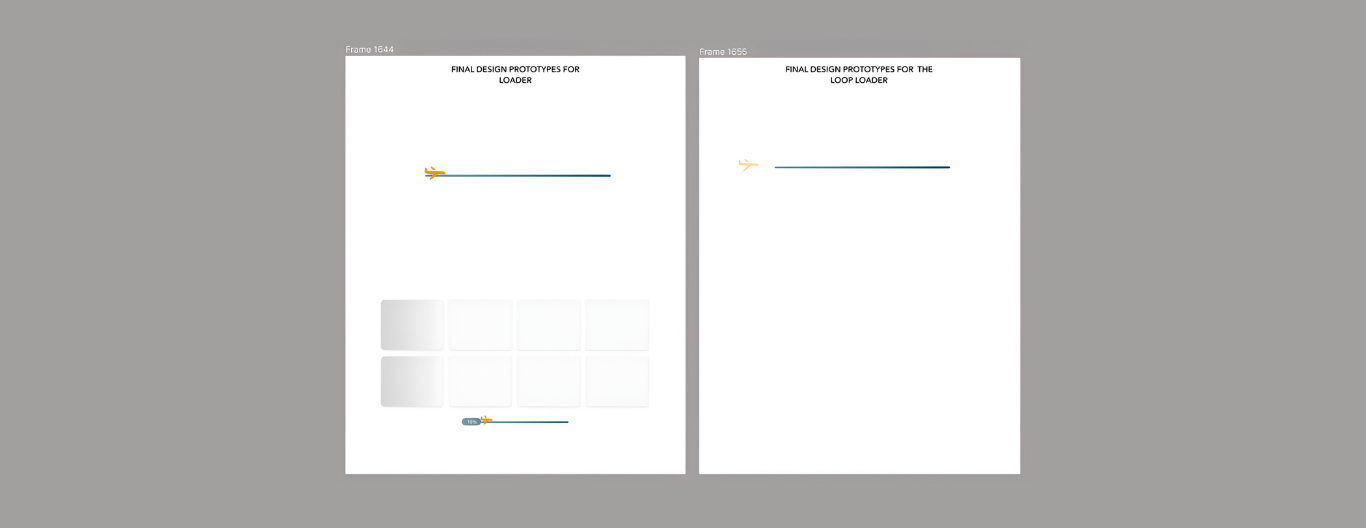
- With greater understanding, I began to develop ideas for the three different kinds of loaders: loop, content, and percentage loaders. Brainstorming sessions and low-fidelity prototypes were highlights of this stage, where ideas were openly discussed and no concept was too bold for consideration.
- Following this, a few concepts were refined and improved to create a better Figma prototype that would enable project owners and the design team to provide input. I made a lot of changes to the designs at this phase in response to feedback and our collective experience. Every loader was designed with a particular function and user experience in mind; this included handling content-heavy pages with ease and showing clear loading progress.
- I created draft GIFs from the designs once they were finalized by creating multiple time frames. These prototypes fulfilled two functions for us: they gave us a clear knowledge of how each loader should work and they helped us effectively explain our concepts to the team and developers.